
Last summer Hubby treated me to a night out to dinner downtown in the big city for our anniversary. I took my camera along and had to take a picture of a classy building with arches that we passed. Although the structure was beautiful, I was never really happy with the way the photo turned out. It just seemed blah, like it lacked something.

When I saw Unique Exposure's challenge for the week focused on architecture in black and white, I thought of this picture, thinking that it might just turn out nicely with the white arches contrasting against the dark windows.
After converting the image to black and white and bumping up the contrast a little, I love how it turned out! I think this tweaking was just what the photo needed. I think it gives the picture a vintage look and lets the pretty architecture stand out. When I look at it, I can visualize people from the 20's and 30's walking along the street in front of it and visiting in it's rooms. Why those decades? I don't know, but it's what comes to mind for me.
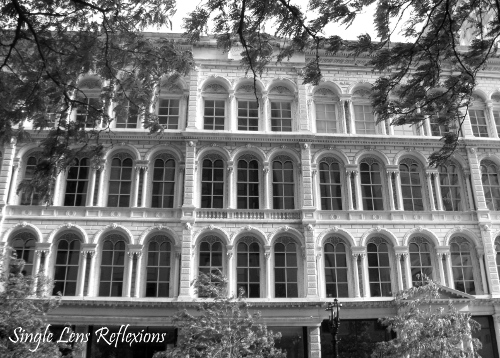
What do you think of this photo in black and white vs. the one in color?


5 comments:
I like it better in the black and white. It's a beautiful photos and the black and white really makes the windows pop!
Wonderful conversion.
because of the trees - I like it better in color. If you'd been able to find a perspective that didn't have all the trees (or if you cropped out the trees) I think the B&W would look good to. Perfect exposure and wonderful contrast :)
Very cool picture! I love architecture pics!! Thank you for sharing!
great architecture photos:)
Post a Comment